'Wellfan 2k7 Posted November 6, 2010 Report Share Posted November 6, 2010 The Canterbury one, absolutely minging. How? In what way? Quote Link to comment Share on other sites More sharing options...
SteelEdge Posted November 6, 2010 Report Share Posted November 6, 2010 How? In what way? TheLip69 has an unnatural hatred for Canterbury. I mind him ranting about it when the deal was announced and then again when the strips were launched. Oh and court jester one for me. Quote Link to comment Share on other sites More sharing options...
Cakes Posted November 6, 2010 Report Share Posted November 6, 2010 TheLip69 has an unnatural hatred for Canterbury. I mind him ranting about it when the deal was announced and then again when the strips were launched. And Leeann Dempster. I think there's an interesting back-story to this one - unrequited love in the field of shirt manufacture/sponsorship. All the makings of a Hollywood blockbuster. Quote Link to comment Share on other sites More sharing options...
Scooby Hugh Posted November 6, 2010 Report Share Posted November 6, 2010 Lost me there, cannae mind that strip at all. Admiral only ever produced a white away kit to my recollection, which was so nice we still wore it even when we changed to adidas. Oh and the adidas one was nowhere near as bad as stated. Cracking plain and simple design, all it needed was a hoop, and maybe a slightly darker tone. Dortmund copycat by Pony was easily the worst, Zoom by Xara equally honking, and again as stated Jester kit might have been okay with plain shorts but overall, truly ganting outfit. I knew you would say that lol Shug P.S. I loved that strip Quote Link to comment Share on other sites More sharing options...
Dexter Dawg Posted November 6, 2010 Report Share Posted November 6, 2010 Agree with Fatcalf,Dortmund Copycat defo worst ahv ever saw Motherwell play in.Mind first game we wore it at Fir Park v Smeltic,looked like Smeltic v Smeltic,I nearly walked straight back out again before kick off. Quote Link to comment Share on other sites More sharing options...
Finlay Posted November 6, 2010 Report Share Posted November 6, 2010 To be honest, big Randy's purple effort this year is as bad as any. Quite like that kit actually. Prefer it to the black one as well. The pink goalie kit was a really bad choice in my opinion. Thankfully it didn't get worn to often. I hated it. Quote Link to comment Share on other sites More sharing options...
'Wellfan 2k7 Posted November 6, 2010 Report Share Posted November 6, 2010 Quite like that kit actually. Prefer it to the black one as well. The pink goalie kit was a really bad choice in my opinion. Thankfully it didn't get worn to often. I hated it. Did we win any game we played in it last season???? The only game I can remember Ruddy wearing it was the 6-6 game and you can see the problem with that. And it was the only one Fraser wore was it not? Quote Link to comment Share on other sites More sharing options...
Finlay Posted November 6, 2010 Report Share Posted November 6, 2010 IIRC Ruddy, when he wore it, used the black shorts and socks with the pink top which didn't make it look quite as bad. Fraser wore the whole pink kit. Terrible. I also think our blue keeper's kit from last season is the best one we have had. Looked cracking. Quote Link to comment Share on other sites More sharing options...
Cakes Posted November 6, 2010 Report Share Posted November 6, 2010 The best Goalie kit we had was the one Hugh Sproat wore. Proper 'keeper's kit. Quote Link to comment Share on other sites More sharing options...
Dexter Dawg Posted November 6, 2010 Report Share Posted November 6, 2010 Shuggie Sproat,what a hero,green shirt v Gers,blue one v Tic.!!! Shuggie Shuggie swing on the bar,Shuggie swing on the bar.!! Quote Link to comment Share on other sites More sharing options...
SteelmaninOZ Posted November 6, 2010 Author Report Share Posted November 6, 2010 The best Goalie kit we had was the one Hugh Sproat wore. Proper 'keeper's kit. Hugh Sproat Didnt he wear a blue top under his goalie top when we played them, and a green top when we played Celtic? Quote Link to comment Share on other sites More sharing options...
Dexter Dawg Posted November 6, 2010 Report Share Posted November 6, 2010 Rankgers top under his shirt???? Dont think so. Quote Link to comment Share on other sites More sharing options...
underboyleheating Posted November 6, 2010 Report Share Posted November 6, 2010 the adidas one was nowhere near as bad as stated. Cracking plain and simple design, all it needed was a hoop, and maybe a slightly darker tone. As a massive fan of old school Adidas, this is another case of what might have been. The quality control on our kits has at certain times through the years has been posted missing. This situation will rarely happen at bigger clubs, where for most of the time corporate colour and historical kit guidelines are generally adhered to. I’m glad at the moment we appear to have got our act together, and now in the main our colours have been standardised. Despite four changes in kit supplier over the last few years, if we continue keep a watchful eye the more yellow tones of yesteryear will remain a thing of the past. Quote Link to comment Share on other sites More sharing options...
SteelmaninOZ Posted November 6, 2010 Author Report Share Posted November 6, 2010 the one on the right ....If only...... Quote Link to comment Share on other sites More sharing options...
fatcalf Posted November 7, 2010 Report Share Posted November 7, 2010 The best Goalie kit we had was the one Hugh Sproat wore. Proper 'keeper's kit. Green top against Rangers Blue one against ra Shellic. Top Man. Quote Link to comment Share on other sites More sharing options...
Yabba's Turd Posted November 7, 2010 Report Share Posted November 7, 2010 Green top against RangersBlue one against ra Shellic. Top Man. +1 Shuggie swing on the bar... Quote Link to comment Share on other sites More sharing options...
SteelmaninOZ Posted November 7, 2010 Author Report Share Posted November 7, 2010 +1 Shuggie swing on the bar... ...and he did.... Quote Link to comment Share on other sites More sharing options...
numpty Posted November 7, 2010 Report Share Posted November 7, 2010 As a massive fan of old school Adidas, this is another case of what might have been. Adidas weren't really in the business of doing custom kits for anyone in those days though -- I had a Nottingham Forest away kit at the time, and it was pretty much identical except the trim and shorts were blue instead of 'claret'. So if they weren't doing anything out of the ordinary for the European Cup holders, probably wasn't much chance of them doing a hoop or a band for us... Quote Link to comment Share on other sites More sharing options...
TheLip69 Posted November 7, 2010 Report Share Posted November 7, 2010 How? In what way? I've always hated Canterbury's stuff it's too fussy, as my gran would say. That shirt had more kiwis on it than anything else, everywhere you lookedd on that strip, shirt, shorts and socks there was a plethora of Kiwis, It had more of Canterbury on it than Motherwell. Quote Link to comment Share on other sites More sharing options...
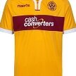
makaveli Posted November 7, 2010 Report Share Posted November 7, 2010 what do people think of this ? Quote Link to comment Share on other sites More sharing options...
Cakes Posted November 7, 2010 Report Share Posted November 7, 2010 It's bogging. Quote Link to comment Share on other sites More sharing options...
'Wellfan 2k7 Posted November 7, 2010 Report Share Posted November 7, 2010 what do people think of this ? If we had that, I would cease being a 'Well fan!!! Far too embarrassing. Quote Link to comment Share on other sites More sharing options...
makaveli Posted November 7, 2010 Report Share Posted November 7, 2010 add a claret sponsor and it would look crackin i think just no one likes change.. its always the same boring shite we get year in year out.. this is someing a bit different Quote Link to comment Share on other sites More sharing options...
SteelmaninOZ Posted November 7, 2010 Author Report Share Posted November 7, 2010 That looks like something the Under 7's would wear. At least he has given it a go can you do better? Quote Link to comment Share on other sites More sharing options...
LadywellToi Posted November 7, 2010 Report Share Posted November 7, 2010 what do people think of this ? "Club Tropicana drinks are freeeeeeeeeeeeeee!" Quote Link to comment Share on other sites More sharing options...


Recommended Posts
Join the conversation
You can post now and register later. If you have an account, sign in now to post with your account.