

Leaderboard


Popular Content
Showing content with the highest reputation on 06/05/2020 in Posts
-
I may have remembered this incorrectly, but I seem to recall Maurice Ross discussing on the podcast some months ago how they try to set up the youth teams to mirror the senior side, so if we play with two wingers in the first team then we have a steady stream of wingers in the youth teams that will hopefully be able to transition seamlessly into the first team when they're ready. This dictates heavily the players that get retained and released each year, and I believe he may also have been bemoaning the lack of attacking/wide players that we had coming through. Again, I may have remembered that wrong. On paper Robinson has some lower level first team experience, youth international experience, is an attacking player, relatively cheap, and was only available due to another club's financial situation (as someone already highlighted, similar to MacIver who hasn't turned out too bad so far). There's plenty other things in the world to be absolutely raging about right now than the signing of one youth player over another...2 points
-
I love it but for those that dont like it I heard a rumour it was designed by Robbo's son.......just kidding folks1 point
-
Thing is, I can fully understand the sponsor being on the actual players kit. They are the focal point of thousands of people every weekend on a football pitch, but why the replicas sold to fans? I doubt Paddy Power, or whoever the sponsor is, will see much extra business from me cutting about Wishaw Tesco in my new away shirt on a Tuesday afternoon.1 point
-
Just returning to this as my question regarding the width of the white hoops has been answered by the new official away shirt and I have to say that I marginally prefer UBH's version. The hooos look better to me with uniform widths. Perhaps the use of four different colours works against being too complicated with any other aspect of the design? I also prefer the simpler collar on his version, though I am generally a fan of an old fashioned style like that used in the official version. I am neither here nor there on the choice between badge or mfc script as both work fine for me. Ultimately, as long as it is not spoiled by the inevitable sponsors logo, the new shirt is another belter.1 point
-
I've just assumed as they've put him front and centre in the new strip launch picture there was no plans for a move in the works. I thought the same about Sean Penn in Game of Thrones mind you.1 point
-
The news today about the streaming option was the final push I needed and tonight I bought my first season ticket in 18 years. If you've been thinking about it and you too need a little persuasion - feel free to use this post as the catalyst to getting a season ticket for this coming season! Here's the link to save you searching for it. Click it once you find your debit / credit card https://www.eticketing.co.uk/motherwellfc1 point
-
I would say someone likes your work ratber a lot UBH!1 point
-
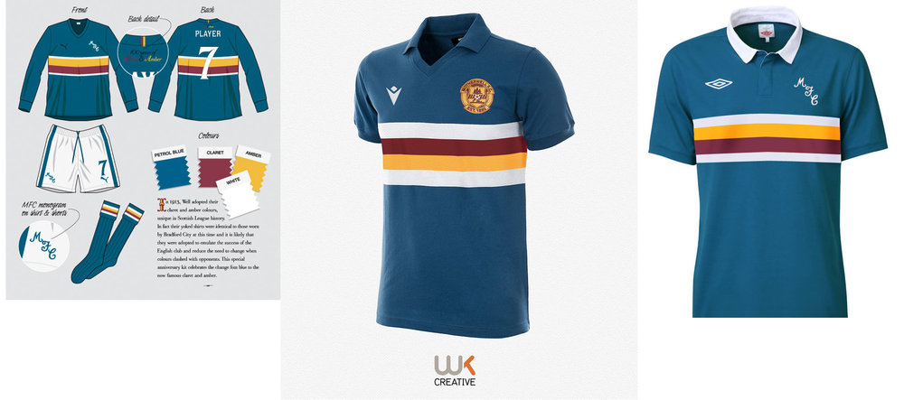
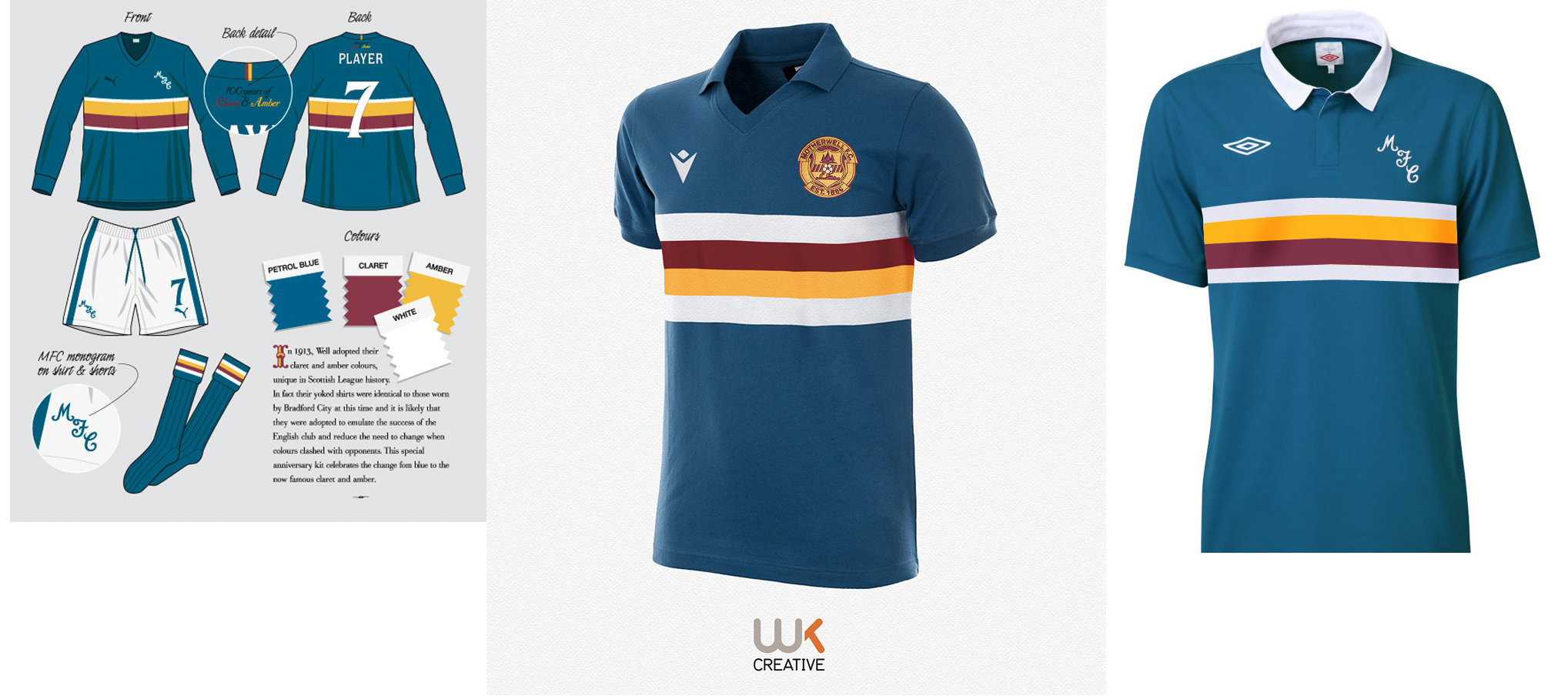
I’ve been wondering for a while, since 2005 I think. Worth noting the Umbro concept I created below was done over 10 years ago in May 2010. It’s pretty dam close design wise to our ‘new’ away. Also a few other blue Samp style concepts. I’ve lost count on how many I’ve done in this style.
 1 point


This leaderboard is set to London/GMT+01:00