

Leaderboard


Popular Content
Showing content with the highest reputation on 06/23/2018 in all areas
-
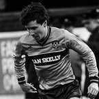
Yes it would be a strange world if we all agreed on everything. However, before I even started the MFC 125 project I consulted with a few designers who are at the top of their game and highly respected within their field. I also contacted Umbro for some information about the original font. They all gave me positive feedback on the recreation and that’s all the encouragement I needed. Some people get it and some people don’t. Just the way of the world I suppose.4 points
-
Thank you Tamwell, and as a fellow designer I am sure you realise the time involved in creating a monogram font from scratch that had its roots in the 60s/70s. This font no longer exists so it’s not as simple as selecting it and typing MFC into Adobe Illustrator. It had to be redrawn from old photographs and made to look like a proper font. I’m not the best designer in the world, however, I have always had pride in my work.2 points
-
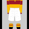
Love the hoop/ band and white shorts and the retro font on the away kit.........home kit would have been better with round or v neck just the usual response on here to new signings / kits1 point
-
As much as the away is class just me that thinks it would be better with the proper badge.1 point
-
You are missing the point. It was produced to replicate our first ever shirt badge, so using an existing font would have defeated its intended purpose. Also I don’t remember ever seeing a “J” with a crossbar. Now that would be odd. So how long have you been a typographer for?1 point
-
What does MJC stand for? Or is it a homage to the guy on here?1 point
-
Mon the annual gathering of the North lanarkshire fashionistas!1 point
-
Hopefully the surprise is that its a wind up and that isn't really our home kit.1 point


This leaderboard is set to London/GMT+01:00