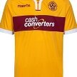
MJC_MKI Posted November 5, 2010 Report Share Posted November 5, 2010 The 'Jester' top itself was okay, but combined with the shorts it just looked as though it was missing the big hat with bells on it to complete the look. The flourescent yellow away kit was easily the worst we've produced in all the time I've been buying Motherwell kits. Cheap, nasty and horrible looking. The Untouchables 'Administration' kit from 02-04 looked pretty cheap but I actually quite liked that one for some reason. I don't know if it was because it came out at a time when the club was going through a bad time and it felt like club and fans were closer than ever or because we got some great memories when the team played in that kit, ie. beating Celtic & Rangers in the one season, the Cup run of 2003, Faddy's brilliance, and the top six finish the following season against all the odds, but whatever it was, that was a top I liked and still have to this day. Quote Link to comment Share on other sites More sharing options...
something else Posted November 5, 2010 Report Share Posted November 5, 2010 This is my all time favourite cos it was the first one i bought plus it was umbro. http://www.historicalkits.co.uk/Scottish_F...5-1987-fgij.gif This is the worst one imo http://www.historicalkits.co.uk/Scottish_F...2-2004-fghk.gif Quote Link to comment Share on other sites More sharing options...
Finlay Posted November 5, 2010 Report Share Posted November 5, 2010 Maybe its my age (Being only 16) But the worst Kit I've seen was definitely the Untouchables kit of 2003-2004. Too boring, too simple. Also the 2006-2007 Home one. And I quite like the Zoom Airlines ones. ...Talking about age, WTF?? Somebody on here isnae gonna like that! Quote Link to comment Share on other sites More sharing options...
Brazilian Posted November 5, 2010 Report Share Posted November 5, 2010 Somebody on here isnae gonna like that! since its now one of the emoticons(?) I reckon Kylies care bear will be along soon demanding equality Quote Link to comment Share on other sites More sharing options...
Coolhandluc Posted November 5, 2010 Report Share Posted November 5, 2010 One word.... Untouchables I liked the simplicity of it, just a bit too orange . Quote Link to comment Share on other sites More sharing options...
Iain7_mfc Posted November 5, 2010 Report Share Posted November 5, 2010 In my lifetime it has to be the jester top. As a youngster a loved the "Dortmund one". Still got it somewhere. Only player i can picture in it though is Eliphas Shivute Quote Link to comment Share on other sites More sharing options...
underboyleheating Posted November 5, 2010 Report Share Posted November 5, 2010 Had to be back when Ally Mcleod was manager that flouro yellow Adidas strip thank phuc it had NO club badge on it can anyone remember it? The only real crime of the Adidas top was the god awful colour. This was probably more the fault of Adidas than Motherwell. This was a standard Adidas template from the time and they probably couldn't be bothered to change the yellow for amber. After all, it was only Motherwell. And as for the lack of badge, it did have the "MFC" logotype on it which I always thought was quite stylish, and which we've brought back on away kits in recent years. The M.F.C script was brought back but sadly not with the same font that was used our original 70's kits. I remember the Mfc on the Admiral Home and Away strip Slightly odd looking design. I had to redraw this monogram for the Bukta retro copy of our Admiral 70's away top. The old logotypes and that yellow Adidas top. Our present club badge is relatively new. I sure it was designed by a fan in a competition run by the club in the early 80's. Does anyone on here know the identity of the winning designer?. Talking about competitions... Somebody on here isnae gonna like that! As a graphic designer, I'm used to people not liking/changing my work. If we all liked the same things, the world would be a very dull place. To be honest, Xara did a good job on what was intended as a homage to our 1950's Cup winning 'rugby style' kits. Unfortunately they didn't include all the design elements that were in the original visual, which in my opinion were an itegral part of the over all feel and look. The original design visual can be seen here. Quote Link to comment Share on other sites More sharing options...
underboyleheating Posted November 5, 2010 Report Share Posted November 5, 2010 As my memory is shit, Fatcalf, or anyone who may know... What did our 80’s Adidas away kit look like? Quote Link to comment Share on other sites More sharing options...
The_Craig Posted November 5, 2010 Report Share Posted November 5, 2010 The illumious yellow change strip was my worst. Still have it in the loft... Like you Iain, I have the enduring image of big Shivute playing in it Quote Link to comment Share on other sites More sharing options...
SteelmaninOZ Posted November 5, 2010 Author Report Share Posted November 5, 2010 This is my all time favourite cos it was the first one i bought plus it was umbro. http://www.historicalkits.co.uk/Scottish_F...5-1987-fgij.gif This is the worst one imo http://www.historicalkits.co.uk/Scottish_F...2-2004-fghk.gif That umbro kit wisnae bad Quote Link to comment Share on other sites More sharing options...
Mad Mac Posted November 6, 2010 Report Share Posted November 6, 2010 While the 'jester' one was absolutely minging, let us not forget that it was entirely appropriate, given that we were managed by a clown at the time.... Quote Link to comment Share on other sites More sharing options...
Mad Dog Posted November 6, 2010 Report Share Posted November 6, 2010 Would anyone be able to post a pic of the 'dortmund' one? I've no memory of that kit despite having the jester shorts. Quote Link to comment Share on other sites More sharing options...
mwellhighland Posted November 6, 2010 Report Share Posted November 6, 2010 Quote Link to comment Share on other sites More sharing options...
decorator Posted November 6, 2010 Report Share Posted November 6, 2010 jester howlin hair worse than the top old skool nice best Quote Link to comment Share on other sites More sharing options...
fatcalf Posted November 6, 2010 Report Share Posted November 6, 2010 As my memory is shit, Fatcalf, or anyone who may know... What did our 80's Adidas away kit look like? We didn't have one, we played Dundee Utd in the League Cup and had to borrow theirs, white with black stripes on sleeves, black shorts, white socks. In the League Cup group 79-80 we wore our white Admiral away kit as in the pic young Deco is sporting, still waiting for info on this Purple admiral away kit cos to my recollection we only had that white one. Quote Link to comment Share on other sites More sharing options...
SteelmaninOZ Posted November 6, 2010 Author Report Share Posted November 6, 2010 That Admiral away kit, Like the claret shorts with the amber and white stripes down the sides of my avatar and white socks with C&A stripes round the top. THE best away kit IMO. Wish I had a picture to post of that Away kit. Anyone got a picture tucked away some where? Quote Link to comment Share on other sites More sharing options...
SteelmaninOZ Posted November 6, 2010 Author Report Share Posted November 6, 2010 As my memory is shit, Fatcalf, or anyone who may know... What did our 80’s Adidas away kit look like? I dont remember ever seeing an Adidas away strip never mind a purple one worn by any Motherwell team. Quote Link to comment Share on other sites More sharing options...
decorator Posted November 6, 2010 Report Share Posted November 6, 2010 tracky Quote Link to comment Share on other sites More sharing options...
SteelmaninOZ Posted November 6, 2010 Author Report Share Posted November 6, 2010 tracky Nice tracky I had one... Quote Link to comment Share on other sites More sharing options...
underboyleheating Posted November 6, 2010 Report Share Posted November 6, 2010 That Admiral away kit, Like the claret shorts with the amber and white stripes down the sides of my avatar and white socks with C&A stripes round the top. THE best away kit IMO. Wish I had a picture to post of that Away kit. Anyone got a picture tucked away some where? Probably just my fading memory but I have no recollection of us wearing the away kit you describe. As SteelmaninOZ says...If anyone has a picture from an old programme, could you please post it. Quote Link to comment Share on other sites More sharing options...
Guest Posted November 6, 2010 Report Share Posted November 6, 2010 To be honest, big Randy's purple effort this year is as bad as any. Quote Link to comment Share on other sites More sharing options...
Geedub Posted November 6, 2010 Report Share Posted November 6, 2010 The worst strip we've ever had is that Zoom Airlines monstrosity. Anyone that says otherwise doesn't have a clue. Quote Link to comment Share on other sites More sharing options...
underboyleheating Posted November 6, 2010 Report Share Posted November 6, 2010 The worst strip we've ever had is that Zoom Airlines monstrosity. Design wise it could have been so different, if they had just given a little thought on that god awful white Zoom sponsor patch. The person that approved this should have been jailed for crimes against shirt design. A side by side comparison, hopefully proves my point. Quote Link to comment Share on other sites More sharing options...
Cakes Posted November 6, 2010 Report Share Posted November 6, 2010 That's a fair point. Your mock-up doesn't look too bad, my gripe with that kit was always the introduction of the blue. Quote Link to comment Share on other sites More sharing options...
TheLip69 Posted November 6, 2010 Report Share Posted November 6, 2010 The Canterbury one, absolutely minging. Quote Link to comment Share on other sites More sharing options...


Recommended Posts
Join the conversation
You can post now and register later. If you have an account, sign in now to post with your account.