All Activity
- Past hour
-
Thought about getting mine with "Thatcher's Still Dead" on the back
- Today
-
Are you MJC.......are you MJC......are you MJC in disguise?.........arrreeeee you M J C innnnnn disssssss....guissseeeeeee 🤣🤣 Only joking pal
-
I really like that, I like the ravenscraig link but I agree the British steel discussion from earlier. But it is a nod to the area and our family members, who most of us all have, who have connections to working there. i like sky blue as well (much nicer than “petrol”blue imo) and it sits nicely with claret and amber. I also agree even as an old fella, I’d buy that if it had “we fkn hate thatcher” on it (as the main sponsor)
-
I really like it
-
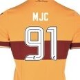
I'm long past the age of buying replica kit, but i agree its awful, no club badge not enough claret and amber, and a logo that nobody will recognise unless you tell them. and my pet hate a dodgy sponsors logo. Another corporate creation that you don't recognise as a Motherwell kit, so no doubt it will sell well
-
Agreed on both counts. I guarantee, however, there will be complaints about the new SO too when sections of our fans don't get their way.
-
Pretty much my view, although I do love the colours, just not for us. I'm struggling to find our connection with Argentinian blue? Far more appropriate to the likes of Scunthorpe United, I would have thought. Have we borrowed one of their designs? If we're going to go down the route of an historical emblem again in future, I'll make a strong case for pit winding gear. That would be iconic.
-
There are rules and laws in place for good reason. Then there are self-important pricks who go beyond them, make it up as they go, and get it wrong through sheer incompetence.
-
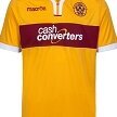
I really like the kit. Love the sentiment behind it with the 30th anniversary coming up. I do prefer the petrol blue we have used before, but this also works well with the claret & amber trim. Quite plain and simple with some more subtle detail. Kind of torn on the British Steel logo, as Steelman 1991 says, the organisation weren't blameless during the closure, but it does link into the community sentiment and the workers were a bigger a part of the place than the management ever were. Would buy one in a second without the G4 Claims sponsor. Will wait to see it in the flesh before I decide to part with my cash. 8/10.
-
I get the whole meaning behind it and how massive Ravenscraig was as we all must have had a relative working there. Was devastating when it closed. I don't like the colours though, just my opinion
-
For a Dollar. ( one for Robocop fans)
-
9/10? Think you have made a typo !! Lol, never seen you give a rating like that 🤣 😂 😅
-
Given how creative Macron have been with other kit designs this summer, the cooling towers may have been a more fitting touch and more pleasing on the eye. I also don’t get the shade of blue. Two below par efforts for me this year.
-
Only my opinion......but it's fecking HORRID
-
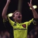
Balmer back in his first club's colours:
-
Could we have that where the sponsor is?
-
I’d buy that.
-
Maybe it says “We f*cking hate Thatcher” on the inside of the collar…
-
I think we can pay tribute and still have a feeling on the top it didn't blow me away with the design I think it's fine. I preferred last year's tartan and champagne kits but I don't hate this year's away I don't love it either but if it ends up being the kit we win the cup in I'll maybe be swayed to bump it a few points.
-
At first glance it looks very ‘Man City’ but the sleeve trimmings and what appears to be a nod to the British Steel ‘S’ logo in the pattern are a nice touch especially since it will be thirty years next July since the ‘Craig was demolished. The only let down is the ‘mfc’ lettering replacing the badge but I know we used lettering long before the club badge on our kits. A solid 9/10 for me. 👍
-
Would have been better with the "cooling towers" woven into the design, rather than BS - they did little to avoid the demise of Ravenscraig.
-
Nah but it might grow on me
-
"Let's pay a tribute to our Steelmen history, and the devastating impact and loss to the community that many still have to deal with today." Aye, but I don't like the badge.
-
Home badge in white and a collar and that kit would be decent
-
Safety Officers are always going to rub some folk the wrong way because they are responsible for enforcing rules (and laws) some people don't like e.g. no pyro.