All Activity
- Past hour
-
Watching Ross Tierney playing for Bohs against St Pat's on the telly here. He hasn't changed.... a couple of good tackles, a couple of bad ones, set up a couple of good chances, and failed to get his shot away every time he had one himself.
-
Are you Gok Wan.....are you Gok Wan... Are you gok wan in disguise......🤪🤪🤪🤪
-
Don't like the collar ,Don't like the arm trim. They look too tight. How do you get the gig modeling them by the way.
-
What was his surname? How long did he work there? Is he a well fan? My old man helped run the sports and social in the Clyde Alloy and buses were ran to Hampden regularly, my dad was there from 54'ish until he retired in 91
-
Think the collar would do with more amber, it looks a bit Hertzish which is no doubt why their biggest fan loves it.
- Today
-
Totally agree. It’s just gash.
-
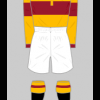
For me the kit is a bit bland being pretty much all sky blue with minimal design. Would have been better with a claret band, trim and white shorts.
-
Thatcher privatised British Steel. While they might not be blameless if you look online there are people who think that was just paving the way for the closure My grandpa worked for Colvilles in Shields Road at the Clyde alloy. He was an electrical engineer and his pay was poor for the job he did and the qualifications he had. They went out on strike for better conditions to no avail.
-
Think it’s a nice change……..and unlike some recent Macron away kits has C&A in the trim I like the script (our original- first) badge which reminds me of the early 70’s….. think it would also work with the current home claret shorts
-
Not a bad shout. While British Steel shoulder some of the blame, if they were a bank with those financial problems the government of the day would have been more than happy to throw our tax money at them and keep them afloat.
-
Thought about getting mine with "Thatcher's Still Dead" on the back
-
Are you MJC.......are you MJC......are you MJC in disguise?.........arrreeeee you M J C innnnnn disssssss....guissseeeeeee 🤣🤣 Only joking pal
-
I really like that, I like the ravenscraig link but I agree the British steel discussion from earlier. But it is a nod to the area and our family members, who most of us all have, who have connections to working there. i like sky blue as well (much nicer than “petrol”blue imo) and it sits nicely with claret and amber. I also agree even as an old fella, I’d buy that if it had “we fkn hate thatcher” on it (as the main sponsor)
-
I really like it
-
I'm long past the age of buying replica kit, but i agree its awful, no club badge not enough claret and amber, and a logo that nobody will recognise unless you tell them. and my pet hate a dodgy sponsors logo. Another corporate creation that you don't recognise as a Motherwell kit, so no doubt it will sell well
-
Agreed on both counts. I guarantee, however, there will be complaints about the new SO too when sections of our fans don't get their way.
-
Pretty much my view, although I do love the colours, just not for us. I'm struggling to find our connection with Argentinian blue? Far more appropriate to the likes of Scunthorpe United, I would have thought. Have we borrowed one of their designs? If we're going to go down the route of an historical emblem again in future, I'll make a strong case for pit winding gear. That would be iconic.
-
There are rules and laws in place for good reason. Then there are self-important pricks who go beyond them, make it up as they go, and get it wrong through sheer incompetence.
-
I really like the kit. Love the sentiment behind it with the 30th anniversary coming up. I do prefer the petrol blue we have used before, but this also works well with the claret & amber trim. Quite plain and simple with some more subtle detail. Kind of torn on the British Steel logo, as Steelman 1991 says, the organisation weren't blameless during the closure, but it does link into the community sentiment and the workers were a bigger a part of the place than the management ever were. Would buy one in a second without the G4 Claims sponsor. Will wait to see it in the flesh before I decide to part with my cash. 8/10.
-
I get the whole meaning behind it and how massive Ravenscraig was as we all must have had a relative working there. Was devastating when it closed. I don't like the colours though, just my opinion
-
For a Dollar. ( one for Robocop fans)
-
9/10? Think you have made a typo !! Lol, never seen you give a rating like that 🤣 😂 😅
-
Given how creative Macron have been with other kit designs this summer, the cooling towers may have been a more fitting touch and more pleasing on the eye. I also don’t get the shade of blue. Two below par efforts for me this year.
-
Only my opinion......but it's fecking HORRID
-
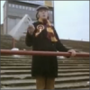
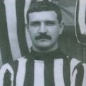
Balmer back in his first club's colours: