

Leaderboard


Popular Content
Showing content with the highest reputation on 03/09/2021 in all areas
-
You really are an odious little cunt.8 points
-
The current pandemic will be ancient history before we win a cup, so it probably won't be an issue by then. But if you think breaking lockdown rules, potentially spreading a deadly virus, trashing public property, and showing no respect for people's health is OK then add your own name to the list of Fannies4 points
-
Rangers fans are fannies Anyone gushing at the vagina about them on here who never cared enough to post when it was celtic fans at their protests , their covid cup final, their 8 and a half in a row or St Johnstone fans last week is also a fanny. Anyone who thinks that should we win the cup there wont be similar scenes here with our fans is definitely a fanny2 points
-
I certainly have no complaints with Macron who have done some really nice kits for us. I live in hope, however, of seeing another Adidas one some day. They have made some iconic designs like that German shirt and another favourite of mine - the Stefan Edberg shirt from the 80s. I had the blue version Although it might be a case of "you had to be there"2 points
-
My preferences for next season

 1 point
 -
I despise both cheeks of the erse. I dread it when we play them, home or away. None less though when our there are 5,000 of them behaving like a bunch of absolute reprobates in our stadium, a fair portion of them from Motherwell. What was remarkable though was Steven Gerrard and co hanging our the changing room windows on Edmiston Drive and then up at the gates encouraging it. It is hilarious that yet again they have sent letters and made noise about a big bad man doing it and running away whilst playing the victim regarding government statements. To hell with them. I am glad that 10 in a row never happened as it would've been a disgrace. In fact, anything over 2 in a row is a national disgrace to the game. I just wish someone other than the blue lot had stopped them. Thought for years that the two Edinburgh clubs and Aberdeen have the potential resources and fanbase that if they got a grip they could put a serious challenge up but the mentality in Scottish football is absolutely howfin.1 point
-
As far as I am concerned Rangers fans are scum. It is a long time since I braved Ibrox but always found the walk from the car very intimidating. I am old enough to remember the time in the seventies when they broke in at Fir Park when we were ahead, the game got stopped and we lost after the restart. No action by the SFA. Rangers have been in three European finals and two of them, Barcelona and Manchester have ended in riots yet the media continue to fawn over them.1 point
-
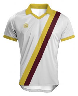
As the artist responsible for restoring, and redrawing the MFC script I will need to agree to disagree on your critical appraisal of the design that first appeared on our 1969-70 Umbro shirt. However, it’s probably more well known as the monogram that featured on our classic 70s sash shirts that I loved as a boy. I suspect it’s here to stay, as it now features in the revamped tunnel area of Fir Park. There was certainly nothing amateur about my approach to redrawing the monogram. As someone who has been involved in professional graphic design and typography for 40 years I can assure you that retro doesn’t always equate to something being amateurish or hideous. A claret away shirt with a white and claret stripe wouldn’t really work, unless the claret sash was much darker than the claret base.1 point
-
have a look at yourself FFS, thats an outrageous comment, people are dying every day and you are spouting pish like this.1 point
-
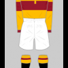
As I say every year whatever the design it should have the proper club crest and NOT the retro MFC lettering. Might be historic for the club - but it is retro for a reason. Looks amateur and hideous. This season's shirt has been the best home kit I can remember. Everything about it has full marks from me, the collar, the design and the material. I get why we make a new one every season for revenue purposes but if we can broadly replicate this season's I'd buy it again. As for a new away, I'd like to see an all claret shirt with maybe a white and claret diagonal band, with white shorts. Don't generally buy the away top but open to being persuaded! We have had a few horror kits in recent times - pretty much every shirt which had cash convertors on it (that alone would put you off, but hey it was a good sponsorship deal I'm led to believe), along with some of the hideous collars that Macron are capable of producing! For anyone interested this is a good record of our kits over the years: https://www.oldfootballshirts.com/en/teams/m/motherwell/old-motherwell-football-shirts-t171.html1 point
-
Since the chances of our reaching the later stages of either European competition are virtually nil, there is no real excuse for not playing in a proper hoop. I seem to remember that UEFA rules on contrast were cited by Alan Burroughs as the reason for not doing so but this is simpy not the case for the early stages of these competitions. But I'm a reasonable man and even a hoop one season in two would keep me happy, since I know a lot of younger fans don't have the attachment to it old fogies like wot I am do. As for the change, our classic floodlight design is basically sound, although I would like a Sampdoria sandwich-style band/hoop occasionally. Don't call me old-fashioned, call me Stalin .1 point
-
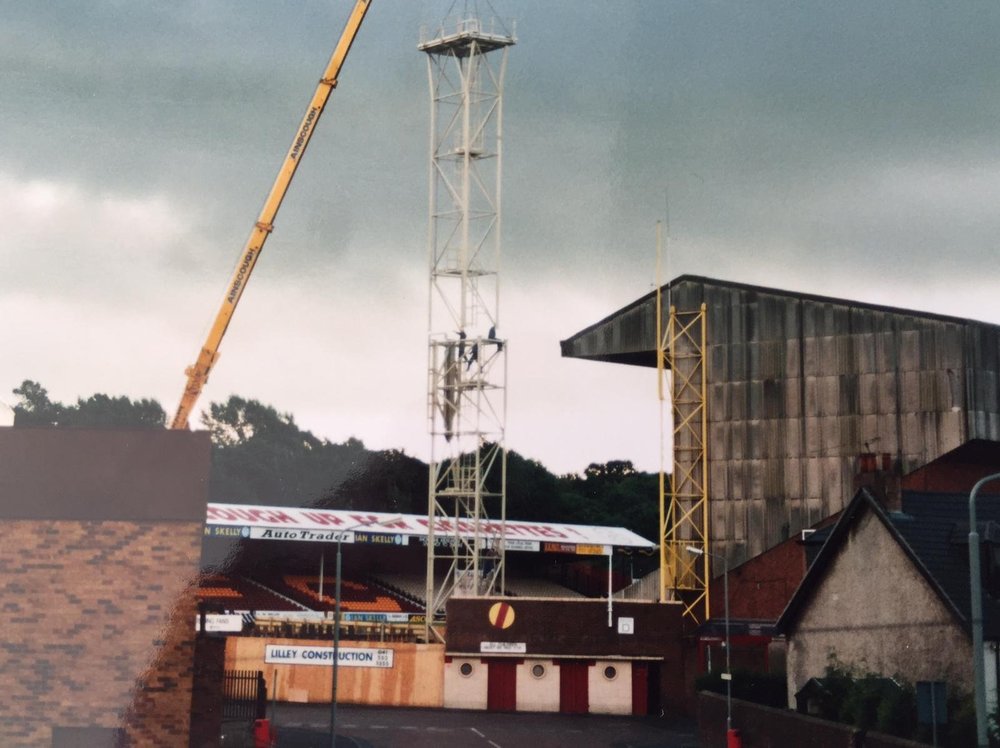
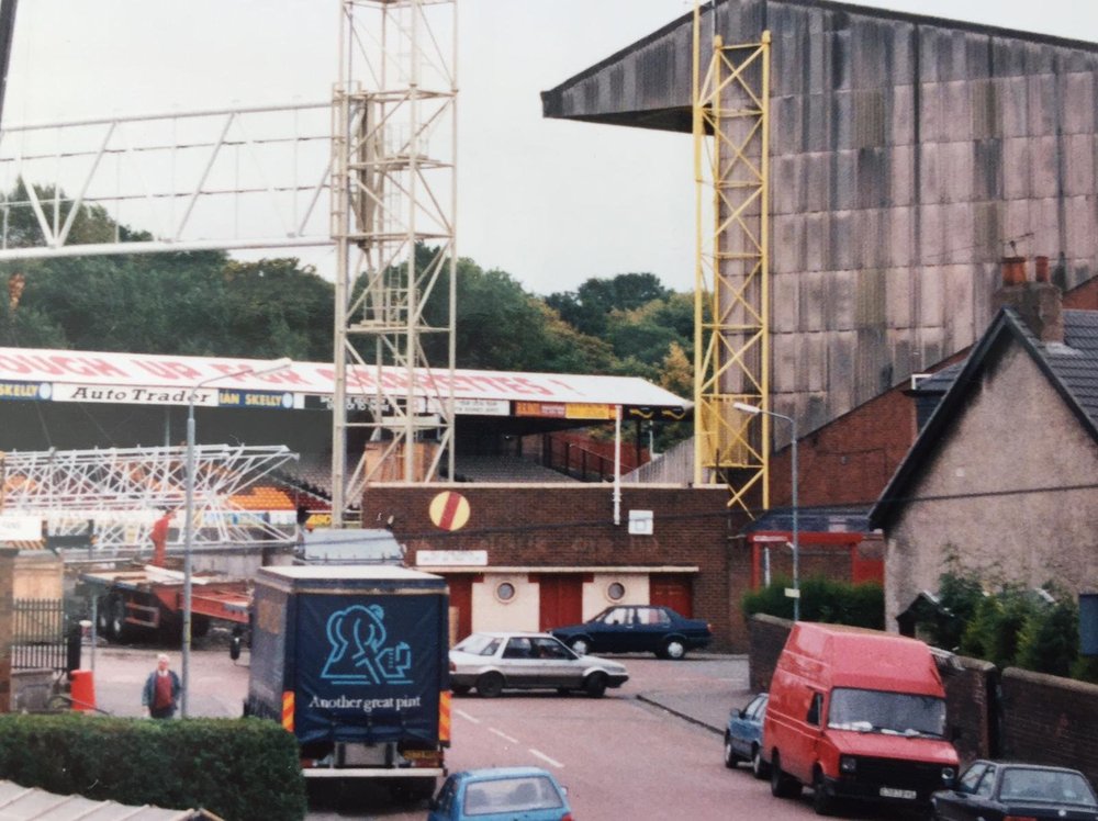
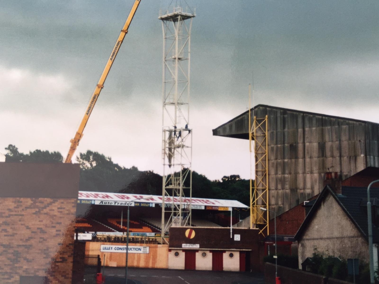
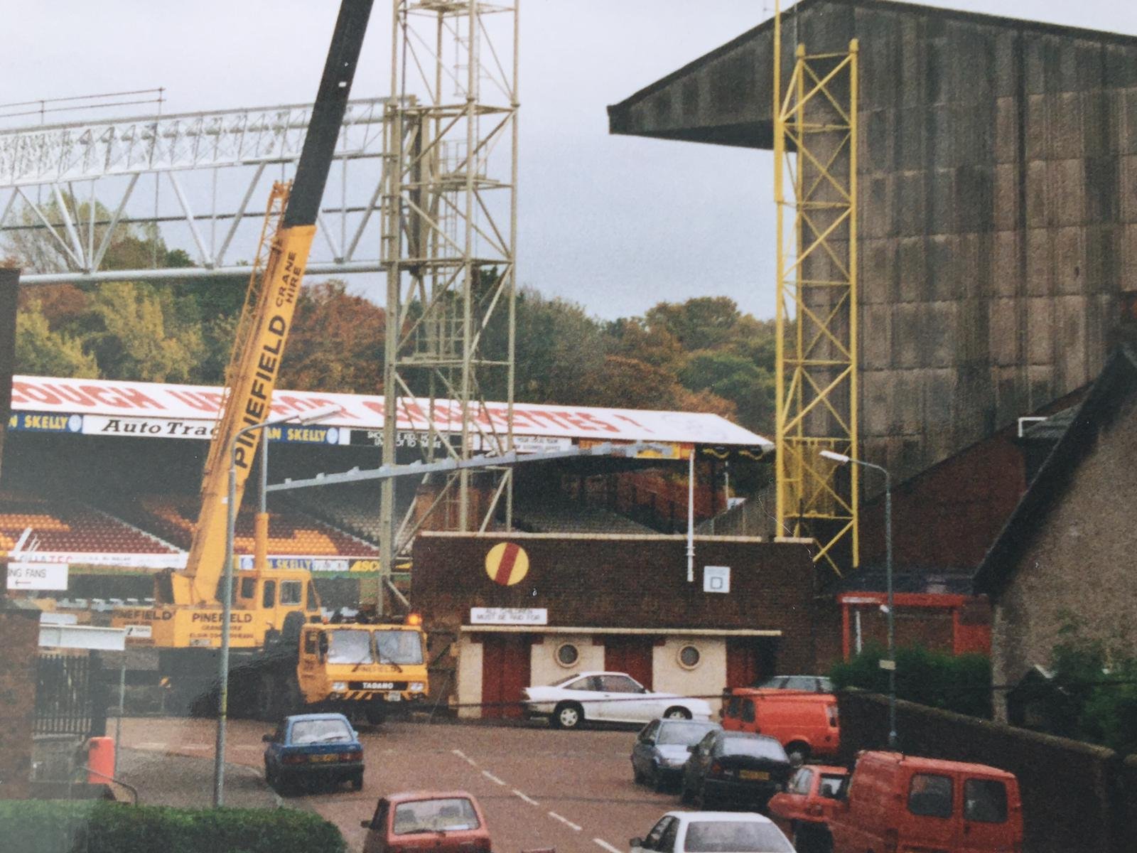
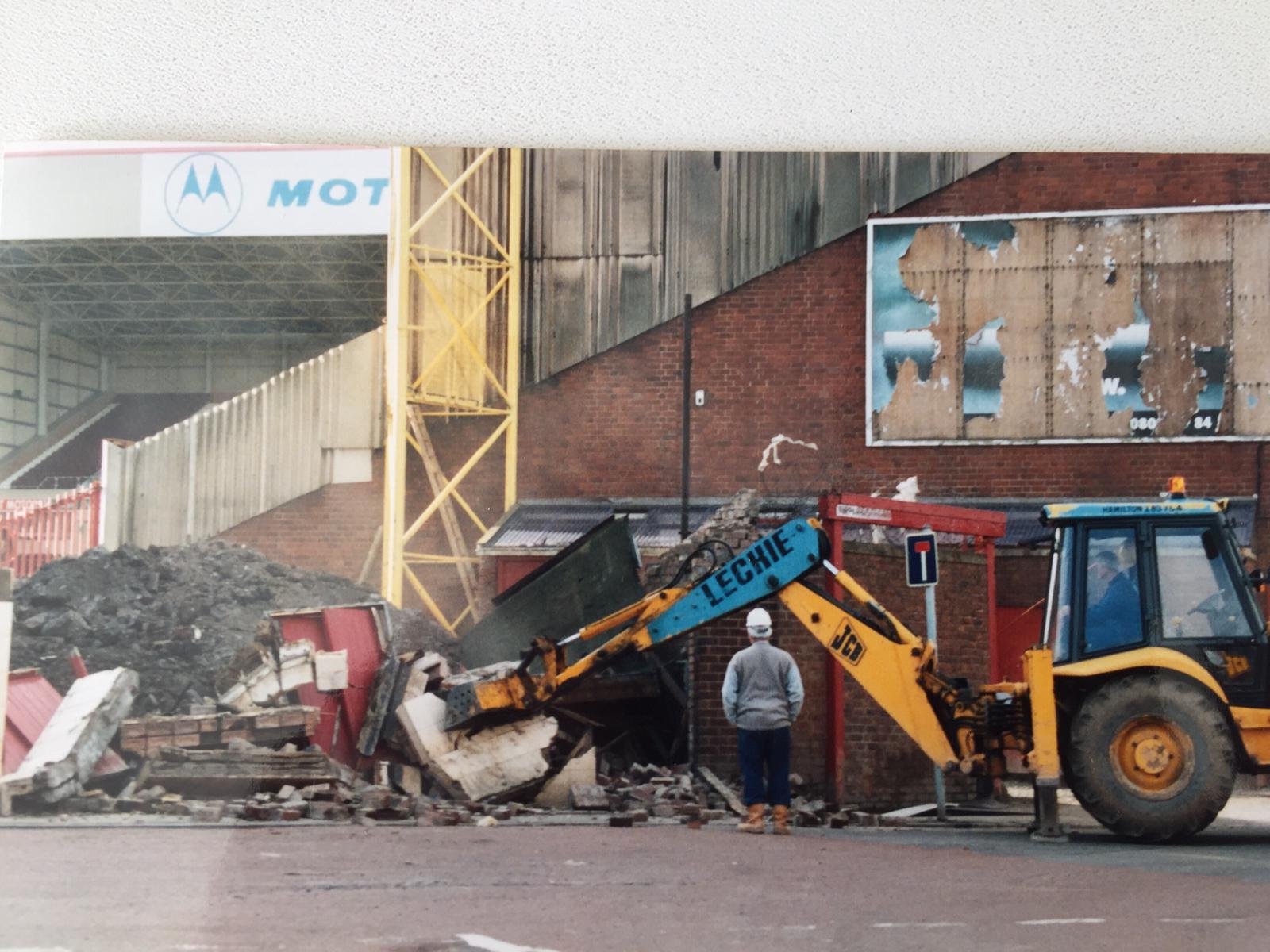
Early days of construction on the Davie Cooper Stand / demolition of the classic frontage.

 1 point
 -
I never said it was ok in fact i only went and offered my opinion on them in the first 4 words of the post The frothing at the mouth , keyboard thumping and faux outrage by some who didnt give two hoots when other sets of fans were doing it, as recently as last week isnt very convincing though0 points
-
I thought all this pish was over last year. How many people died because of Strathy Park or Brighton Beach? Zero. You have more chance catching it in a supermarket than outside on the street.-4 points


This leaderboard is set to London/GMT+01:00