

Leaderboard


Popular Content
Showing content with the highest reputation on 04/26/2020 in Posts
-
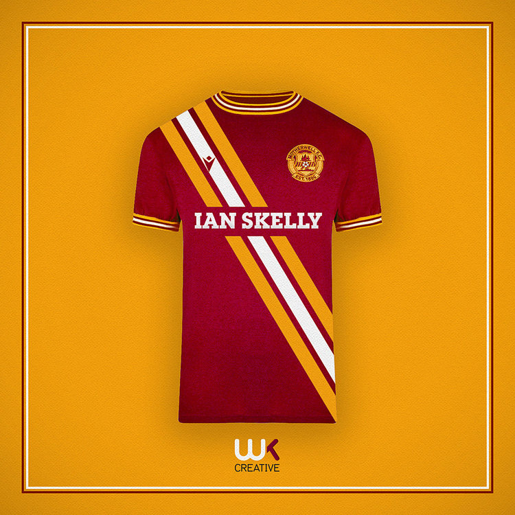
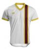
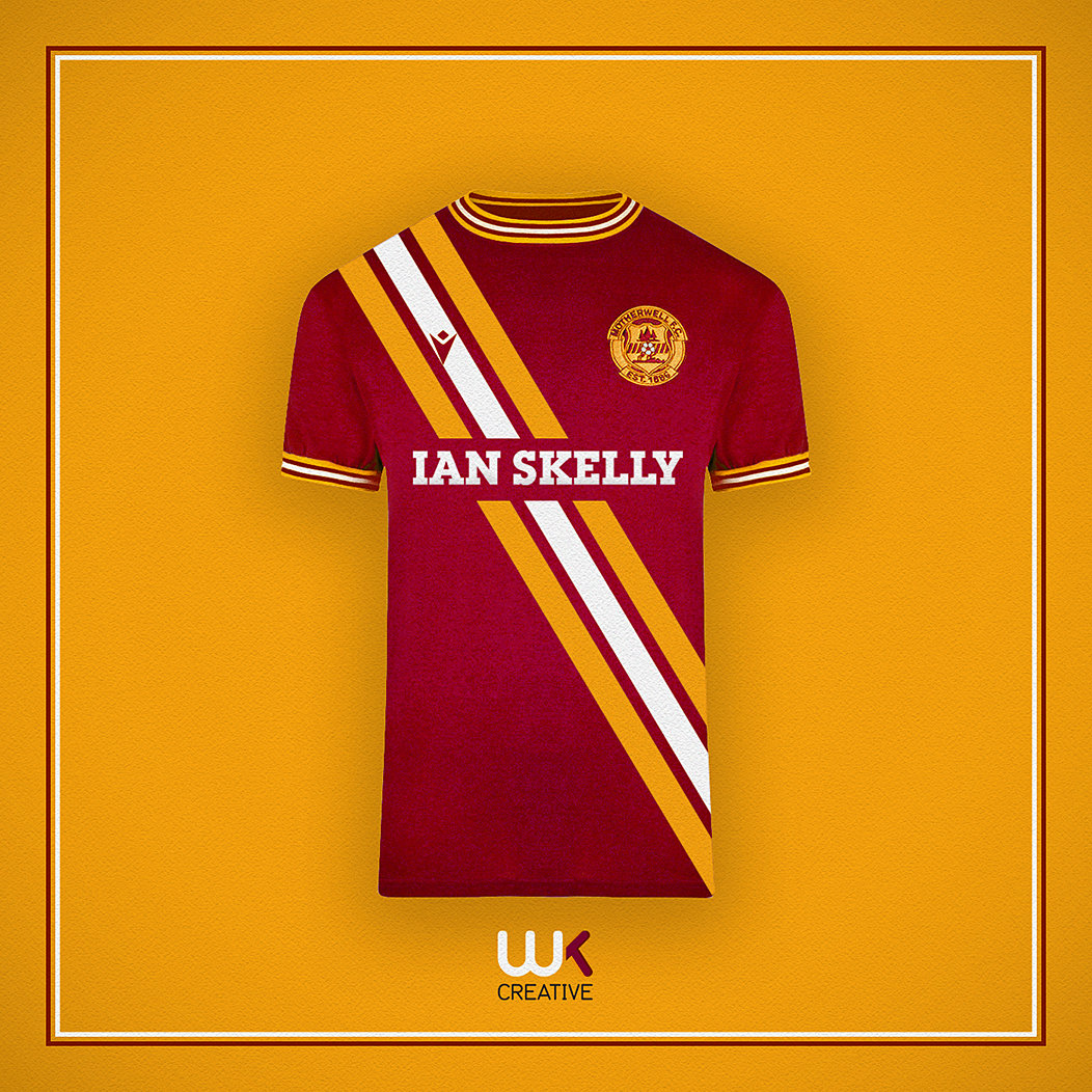
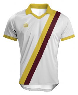
Here it is. Admiral did a bold stripe sash in the 70s and my original idea was to do a take on that. However, the Macron badge complicates it a bit.
 2 points
 -
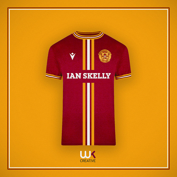
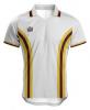
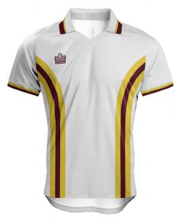
A less traditional design concept from me. An away shirt based around the classic 1960s Fred Perry mod style crewneck collar. Also with a hint of 1970s Admiral on the three bold front stripes.
 2 points
 -
Love a white top with Claret and amber.......right on q UBH !!!!!

 1 point
 -
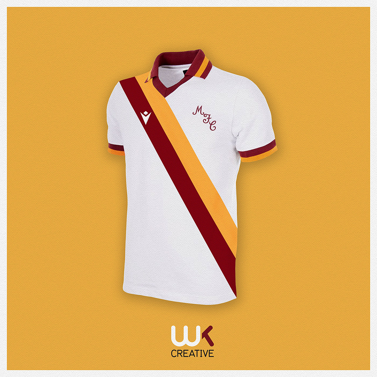
Last one for today. White would be my away colour of choice, but the kit washer wouldn’t thank me. This is a mash up between Roma 80s and Motherwell 70s. I’ve always loved a two tone sash shirt especially in claret & amber.
 1 point
 -
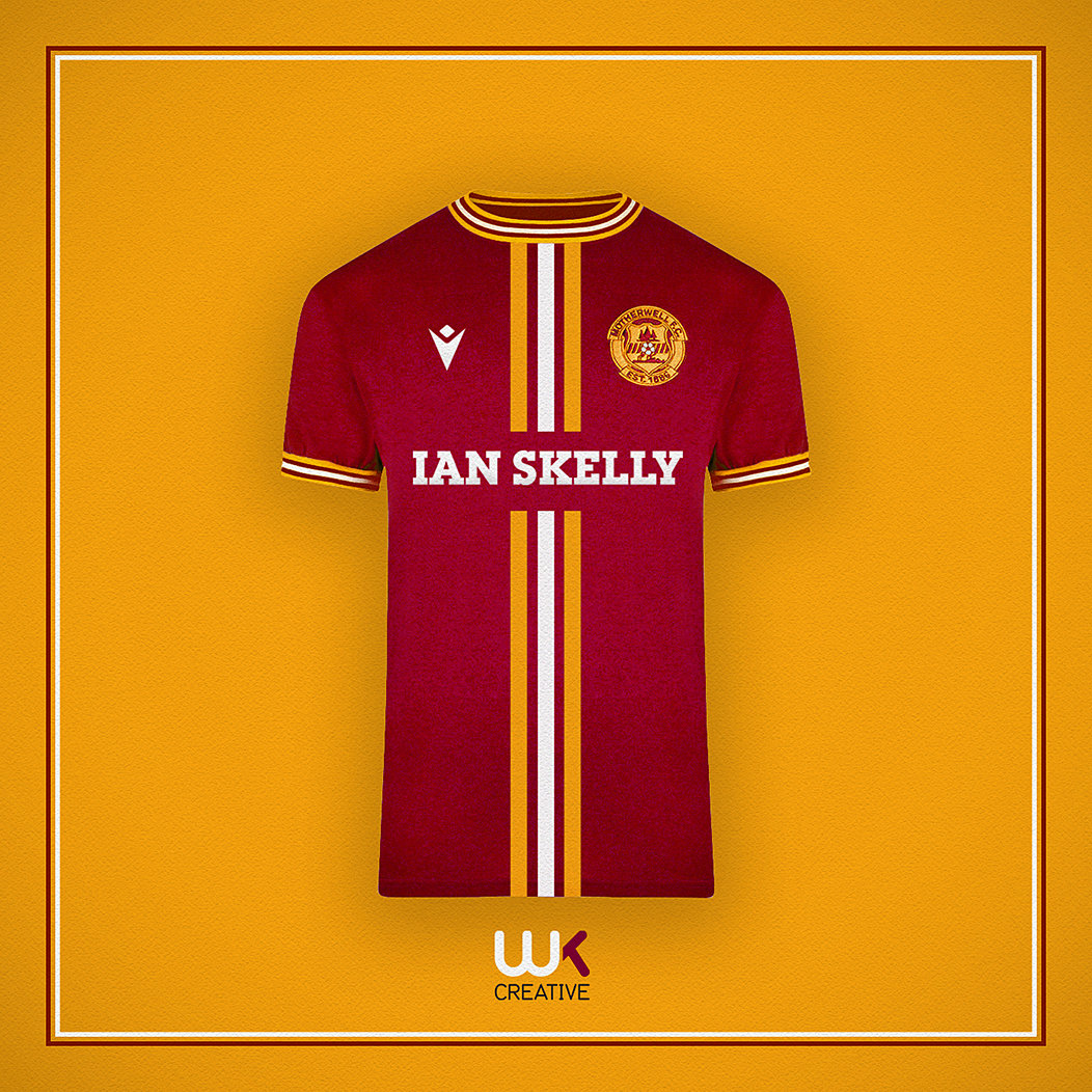
Looks great, but think it might work even better with the main stripe as the old 1970's diagonal.1 point
-
1 point
-
Indeed, many thanks to UBH for is sterling efforts with regard strip design. One of the things he seems to get spot on, the recent blue and claret designs being prime examples, is keeping things simple and not complicating things with too much fussy detailing. How many half decent shirt designs have we seen ruined by s ridiculous collar or cuff embellishment?1 point
-
It doesn't mean the story came from the club, though. Sadly, the days of journalists only publishing an article when they have 2 independently confirmed sources are long gone; especially on the internet. Onthefringes has consistently proved to be a much more reliable source.1 point
-
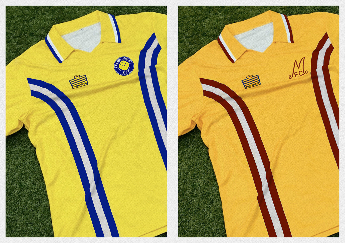
I recently did a fun take on the Admiral tramline shirt to reimagine it in C&A. I also did one for Leeds United fans as we used the same Admiral template as us.
 1 point
 -
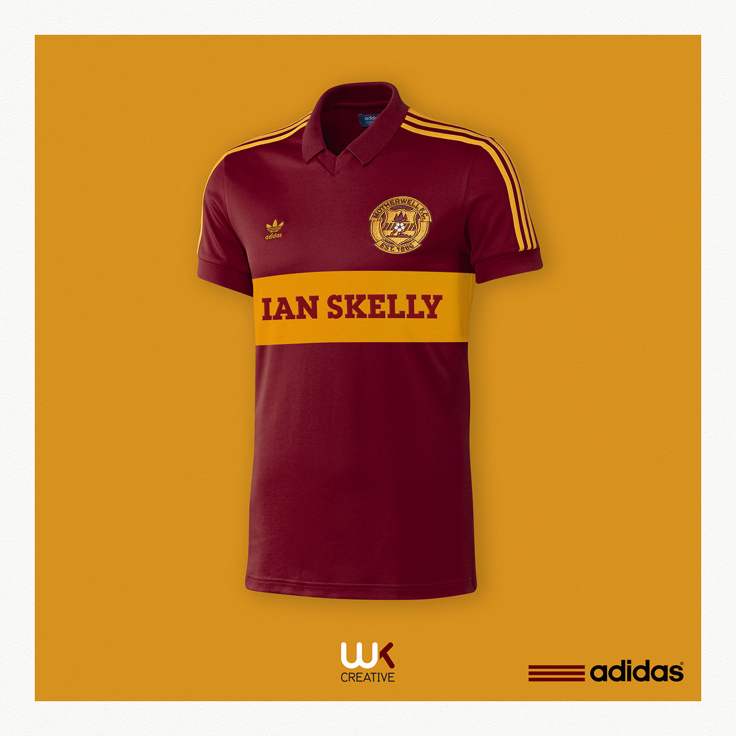
The reverse of our traditional claret hoop/amber shirt has been utilised several times over the years by various manufacturers. Here’s my ‘what if’ adidas had produced it in the 80s. I think it’s probably due a reboot as we last utilised it in 2002.
 1 point
 -
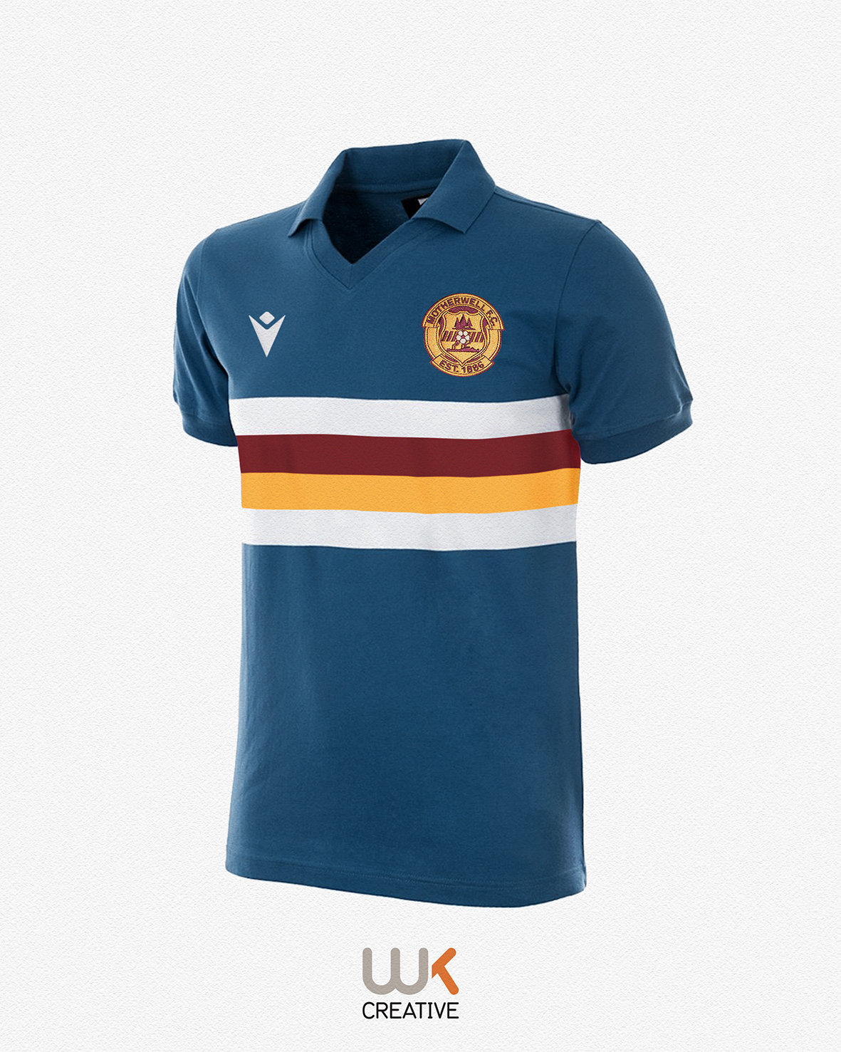
I was a supporter of Motherwell’s 2012-13 ‘petrol blue’ shirt. However, I suspect the shirt that was eventually released was a Puma template that lacked the distinctive 4 bold hooped white/claret/amber/white Sampdoria feel I was pushing for on here at the time. The blue shirt wasn’t to everybody’s taste, although, the colour played an important part in our early kit history. This is another ‘what if’ concept done in a bold hoop Sampdoria style.
 1 point
 -
Couldn't agree more. Thankfully, aside from the few oddballs on here these views are shared by the vast majority of the support.1 point
-
I think anyone with an axe to grind with Burrows needs to take a hard look at the difference in the club since he worked his way up the ranks. I heard nothing positive about Leeann Dempster towards the end and the finances of the club were going back down the tube. Burrows has the club a more professional looking outfit looking inward and the feel of the club in general is much more positive. On top of that the board have more than proven themselves over the clubs management past few years. It certainly seems to me that MFC at the moment is the best run it has been in my lifetime of following the club anyway.1 point


This leaderboard is set to London/GMT+01:00