SteelmaninOZ Posted July 18, 2024 Report Share Posted July 18, 2024 A wee bit of tartan Quote Link to comment Share on other sites More sharing options...
Onthefringes Posted July 18, 2024 Report Share Posted July 18, 2024 It’s awful. I’m all for the main colour, but, don’t get the need for the tartan trim. 4 Quote Link to comment Share on other sites More sharing options...
Spiderpig Posted July 18, 2024 Report Share Posted July 18, 2024 11 minutes ago, Onthefringes said: It’s awful. I’m all for the main colour, but, don’t get the need for the tartan trim. With you on that, same as the home kit another decent strip ruined by unnecessary embellishments, 2 simple claret and Amber strips on the sleeves would have been sufficient. All you see when you look at the strip are the in your face tartan armbands, very tacky. 1 Quote Link to comment Share on other sites More sharing options...
joewarkfanclub Posted July 18, 2024 Report Share Posted July 18, 2024 Its not horrible, but..... The tartan trim on the sleeves is too big. They shoulda made it more subtle like the trim round the neck. Also not too fussed on v neck shirts. And Id pay more to get it without the sponsor! Quote Link to comment Share on other sites More sharing options...
Ya Bezzer! Posted July 18, 2024 Report Share Posted July 18, 2024 Another stinker. Not even sure we could wear that against Hearts so probably only wear it against Dundee United and Aberdeen. 1 Quote Link to comment Share on other sites More sharing options...
weeyin Posted July 18, 2024 Report Share Posted July 18, 2024 On 6/25/2024 at 12:27 PM, weeyin said: I love/hate the new white/claret shorts and love/hate the claret/black/amber socks. I always loved/hated the hoop/half hoop/no hoop tops and the new collar is class/gantin'. The sponsor's logo is cheap/OK/classic and the trim needs no change/tweaked/binned. Just the weans/nobody/everyone will be buying this. Congratulations/Are you on drugs/WTF? to all involved/ Different colours, same idea. Quote Link to comment Share on other sites More sharing options...
StAndrew7 Posted July 18, 2024 Report Share Posted July 18, 2024 2 hours ago, Onthefringes said: It’s awful. I’m all for the main colour, but, don’t get the need for the tartan trim. I think Jim McMahon did. Reeks of the Exec Board in their club ties. It's also quite telling that the first two post-Burrows strips are... polarising. I actually don't mind the away top much, but want to see it in person before I make a final call on getting it, or buying the training gear instead. Quote Link to comment Share on other sites More sharing options...
Mccus28 Posted July 18, 2024 Report Share Posted July 18, 2024 I really like this kit 🤷♂️ Quote Link to comment Share on other sites More sharing options...
El Grew Posted July 18, 2024 Report Share Posted July 18, 2024 🤮🤮🤮 Why black? The trim looks more red & yellow than claret & amber especially on the socks. We could pass for Partick Thistle in this get-up! Sorry I’m a traditionalist and IMO our change strip should always be white with claret & amber trim. 5 Quote Link to comment Share on other sites More sharing options...
Lobey_Dosser Posted July 18, 2024 Report Share Posted July 18, 2024 I bought into the home design but I can’t see me warming to the away effort. A subtle tartan trim can work lovely on a kit (previous Scotland top springs to mind) but our official tartan is far too garish imo. An issue that is compounded by the width of the sleeve trim. Carrying the tartan pattern through the grey is poorly thought out too, far too messy in the end. 1 Quote Link to comment Share on other sites More sharing options...
Spiderpig Posted July 18, 2024 Report Share Posted July 18, 2024 41 minutes ago, El Grew said: 🤮🤮🤮 Why black? The trim looks more red & yellow than claret & amber especially on the socks. We could pass for Partick Thistle in this get-up! Sorry I’m a traditionalist and IMO our change strip should always be white with claret & amber trim. It's not black it's Steel Grey according to the club. That said I don't like it either. Quote Link to comment Share on other sites More sharing options...
weeyin Posted July 18, 2024 Report Share Posted July 18, 2024 1 hour ago, El Grew said: 🤮🤮🤮 Why black? The trim looks more red & yellow than claret & amber especially on the socks. We could pass for Partick Thistle in this get-up! Sorry I’m a traditionalist and IMO our change strip should always be white with claret & amber trim. Like me, and most others posting, you aren't the target market. And make no mistake, the kit is designed to sell to the kit, not for the benefit of the team. Kit manufacturers care more about how a short looks with jeans, because that is where they make their money. Keeping traditional every season would reduce sales. Quote Link to comment Share on other sites More sharing options...
David Posted July 18, 2024 Report Share Posted July 18, 2024 For those who don't like the current offering, there's these two crackers on the website as well... Quote Link to comment Share on other sites More sharing options...
robsterwood Posted July 18, 2024 Report Share Posted July 18, 2024 Love the new away strip. Class. Love black strips generally and love the trim. Job well done. Will be buying one for my son. Quote Link to comment Share on other sites More sharing options...
mio Posted July 18, 2024 Report Share Posted July 18, 2024 I don’t mind either of the kits this season, both a little different. its not like we are stuck with the same kit for 3yrs anymore so I don’t think creating something a bit out there is too concerning, as it’ll be half price come January and binned by May. it is a shame tho that we can’t have an iconic one like the white Ian skelly Umbro one or the Motorola (softy 91st min equaliser v dundee utd ) top. Quote Link to comment Share on other sites More sharing options...
Pettywulliegrew-2 Posted July 18, 2024 Report Share Posted July 18, 2024 52 minutes ago, David said: For those who don't like the current offering, there's these two crackers on the website as well... Shame the club shop ain’t got a retro style top/ t shirt with a band on it………. Quote Link to comment Share on other sites More sharing options...
weeyin Posted July 18, 2024 Report Share Posted July 18, 2024 26 minutes ago, Pettywulliegrew-2 said: Shame the club shop ain’t got a retro style top/ t shirt with a band on it………. 59 quid from Toffs 3 Quote Link to comment Share on other sites More sharing options...
Kmcalpin Posted July 18, 2024 Report Share Posted July 18, 2024 More suited to a golf course or Bay City Rollers convention. Its orrible. 2 Quote Link to comment Share on other sites More sharing options...
weeyin Posted July 18, 2024 Report Share Posted July 18, 2024 4 minutes ago, Kmcalpin said: More suited to a golf course or Bay City Rollers convention. Its orrible. Suited to a golf course will be another selling point from a Macron perspective. The good thing about Bay City Rollers shirts is that if you don't like this one there will be a new one (Shang)a-lang soon. 1 Quote Link to comment Share on other sites More sharing options...
texanwellfan Posted July 18, 2024 Report Share Posted July 18, 2024 This looks dreadful to me? What are the shorts like or are we wearing kilts with it? 1 Quote Link to comment Share on other sites More sharing options...
grizzlyg Posted July 18, 2024 Report Share Posted July 18, 2024 Not the worst one we have had, certainly different Quote Link to comment Share on other sites More sharing options...
texanwellfan Posted July 18, 2024 Report Share Posted July 18, 2024 14 minutes ago, grizzlyg said: Not the worst one we have had, certainly different I think it might be the worst one we have had. Quote Link to comment Share on other sites More sharing options...
grizzlyg Posted July 18, 2024 Report Share Posted July 18, 2024 9 minutes ago, texanwellfan said: I think it might be the worst one we have had. Although it was famous helicopter Sunday strip I wasn't a fan of it Quote Link to comment Share on other sites More sharing options...
weeyin Posted July 18, 2024 Report Share Posted July 18, 2024 20 minutes ago, texanwellfan said: I think it might be the worst one we have had. I'd say the fluorescent yellow and all the black ones have been worse. Like the first team kit, I'm in the "not bothered" camp. Quote Link to comment Share on other sites More sharing options...
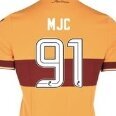
MJC Posted July 18, 2024 Author Report Share Posted July 18, 2024 On 5/8/2023 at 1:50 PM, Mad Dog said: You're right, it's quite nice: https://www.footyheadlines.com/2023/03/dundee-fc-23-24-home-kit-released.html?m= Our new away kit isn’t too different to last seasons Dundee home kit apart from the position of the ‘club’ tartan and the dark blue tone as opposed to the steel grey. Both kits are of course made by Macron. Quote Link to comment Share on other sites More sharing options...


Recommended Posts
Join the conversation
You can post now and register later. If you have an account, sign in now to post with your account.