mio Posted June 23, 2023 Report Share Posted June 23, 2023 Smartest home top in 30yrs wasted a little with a crappy sponsor. full hoop too. Good work macron Quote Link to comment Share on other sites More sharing options...
weeyin Posted June 23, 2023 Report Share Posted June 23, 2023 I can even live with the sponsor on the front. My only niggle is I'm not a fan of having a sponsor below the hoop on the back. I don't mind across the shoulders. Also delighted we've avoided the "lets print some 1970's curtains into the fabric" trend. Quote Link to comment Share on other sites More sharing options...
Happy Dosser Posted June 23, 2023 Report Share Posted June 23, 2023 A real hoop? My flabber is well and truly gasted. Let's hope we can get the players to fill the jersey. Quote Link to comment Share on other sites More sharing options...
grizzlyg Posted June 23, 2023 Report Share Posted June 23, 2023 Excellent strip, now let's keep Casey and make some quality signings to fill them Quote Link to comment Share on other sites More sharing options...
SteelmaninOZ Posted June 23, 2023 Report Share Posted June 23, 2023 What a braw kit agree with all the positive comments Quote Link to comment Share on other sites More sharing options...
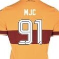
MJC Posted June 23, 2023 Author Report Share Posted June 23, 2023 Our best home kit in years. Simple, traditional and a full claret hoop. Absolutely love it. After last years shanner it is a breath of fresh air. I’d imagine the numbers and names will be in white printing given the C&A combination on the back of the top? Unless we use black. Quote Link to comment Share on other sites More sharing options...
grizzlyg Posted June 23, 2023 Report Share Posted June 23, 2023 33 minutes ago, SteelmaninOZ said: What a braw kit agree with all the positive comments Yup everyone agreeing.....it will never catch on !! Lol 1 Quote Link to comment Share on other sites More sharing options...
grizzlyg Posted June 23, 2023 Report Share Posted June 23, 2023 3 minutes ago, MJC said: Our best home kit in years. Simple, traditional and a full claret hoop. Absolutely love it. After last years shanner it is a breath of fresh air. I’d imagine the numbers and names will be in white printing given the C&A combination on the back of the top? Unless we use black. When MJC is positive it's definitely a good sign,!! Only joking bud 1 Quote Link to comment Share on other sites More sharing options...
joewarkfanclub Posted June 23, 2023 Report Share Posted June 23, 2023 Cracking kit. Traditional design with a modern twist. They will fly off the shelf. Not crazy about the sponsor, but Id feel the same about that regardless of who it was. Couple of decent signings and all will be good in the world again...... Quote Link to comment Share on other sites More sharing options...
MJC Posted June 23, 2023 Author Report Share Posted June 23, 2023 A sponsorless version being an option to buy like the 20/21 kit would be cracking for this one. Though that one was released before the shirt sponsor deal had been signed so it’s probably unlikely in this case. Quote Link to comment Share on other sites More sharing options...
texanwellfan Posted June 23, 2023 Report Share Posted June 23, 2023 Just the one image?? Quote Link to comment Share on other sites More sharing options...
Stuwell2 Posted June 23, 2023 Report Share Posted June 23, 2023 24 minutes ago, texanwellfan said: Just the one image?? Check it out here https://www.motherwellfc.co.uk/wp-content/uploads/2023/06/previews-for-site.jpg 2 Quote Link to comment Share on other sites More sharing options...
Yabba's Turd Posted June 23, 2023 Report Share Posted June 23, 2023 4 hours ago, MJC said: Our best home kit in years. Simple, traditional and a full claret hoop. Absolutely love it. After last years shanner it is a breath of fresh air. I’d imagine the numbers and names will be in white printing given the C&A combination on the back of the top? Unless we use black. Why do you think they have divisive kits every few years? Quote Link to comment Share on other sites More sharing options...
The African Posted June 23, 2023 Report Share Posted June 23, 2023 Very nice looking kit. I agree with those who reckon it would look even better without the sponsors but also realise that they are a financial necessity. Congratulations to all involved on a job well done. Now, if they can bring themselves to stick with a mainly all white away kit, I will be a really happy camper! Quote Link to comment Share on other sites More sharing options...
joewarkfanclub Posted June 23, 2023 Report Share Posted June 23, 2023 3 minutes ago, The African said: Very nice looking kit. I agree with those who reckon it would look even better without the sponsors but also realise that they are a financial necessity. Congratulations to all involved on a job well done. Now, if they can bring themselves to stick with a mainly all white away kit, I will be a really happy camper! I love a white away kit but doubt very much that we will get another one when we had one last year. Its been a while since we had all claret so would think thats likely unless we go totally out the box with whatever fashion colour the marketing team have assessed will sell best. Id quite like another black away kit but with the claret, amber and white bands across the chest like the last blue kit. I like the italian styling of those type of kits. Quote Link to comment Share on other sites More sharing options...
The African Posted June 23, 2023 Report Share Posted June 23, 2023 The problem I see with an all claret away kit is that it defeats the purpose of a kit designed to avoid a clash when the sides we normally change against (Aberdeen, Hearts) play in a similar colour. Having said that, it seems that these days teams use their alternate kit almost on a whim, so maybe it doesn’t really matter? If we are looking for something slightly different for a change, how about avoiding black (for referees and Eastern European goalies only) and grey ( just looks wrong and has an unlucky track record with other clubs) and try something new. Sky blue anyone? Or forest green? Quote Link to comment Share on other sites More sharing options...
MJC Posted June 24, 2023 Author Report Share Posted June 24, 2023 7 hours ago, Yabba's Turd said: Why do you think they have divisive kits every few years? I get that kits need to change and occasionally ‘mix it up’ but kits like last seasons or the jester kit from the 90s just go too far imo. 6 hours ago, The African said: The problem I see with an all claret away kit is that it defeats the purpose of a kit designed to avoid a clash when the sides we normally change against (Aberdeen, Hearts) play in a similar colour. Having said that, it seems that these days teams use their alternate kit almost on a whim, so maybe it doesn’t really matter? That was my biggest gripe with the last claret away kit we had (18/19) that we insisted on wearing in in every away game even when there was no colour clash. The only away games we didn’t wear it were against Aberdeen, Hearts and Dundee. As far as I see it, change kits should only be worn when there is a colour clash with the home team and should NEVER be worn in a home game. But it’s not up to me obviously. Chances are we may bring two change kits out as we did last year, so a claret change kit as the main one wouldn’t be a bad shout. Quote Link to comment Share on other sites More sharing options...
Mad Dog Posted June 24, 2023 Report Share Posted June 24, 2023 If memory serves, we've only ever had one fully grey kit - The 'Higdon' - and it was pretty nice. Quote Link to comment Share on other sites More sharing options...
wellsince75 Posted June 24, 2023 Report Share Posted June 24, 2023 New home stip looks the business - a modern version of our classic home strip. Nice to see a chain of posts that we're agreeing. Away strip . White one may be too similar to last year but I'd be delighted to see either of these. Quote Link to comment Share on other sites More sharing options...
Mio Krivokapic Posted June 24, 2023 Report Share Posted June 24, 2023 Love it. Would be absolutely perfect if it was available with no sponsors name Quote Link to comment Share on other sites More sharing options...
Happy Dosser Posted June 24, 2023 Report Share Posted June 24, 2023 2 hours ago, wellsince75 said: New home stip looks the business - a modern version of our classic home strip. Nice to see a chain of posts that we're agreeing. Away strip . White one may be too similar to last year but I'd be delighted to see either of these. Yup, always loved the classic "floodlight strip" as it used to be called. Last season's white outfit was pretty nice too. 2 Quote Link to comment Share on other sites More sharing options...
Pettywulliegrew-2 Posted June 24, 2023 Report Share Posted June 24, 2023 Lovely kit….always like a hoop…..thought we might have went with amber 🩳 this season….white shorts is always my preference 1 Quote Link to comment Share on other sites More sharing options...
wellfan Posted June 24, 2023 Report Share Posted June 24, 2023 I'm usually agnostic on the view that a sponsor often ruins a shirt; however, not this time. The font size, choice, and asymmetry of that 'G4 Claims' logo completely ruin a lovely shirt design. The logo looks like it was made in MS PowerPoint. It's making me yearn for the delicate and subtle font design of the Paycare logo. Quote Link to comment Share on other sites More sharing options...
numpty Posted June 24, 2023 Report Share Posted June 24, 2023 1 hour ago, wellfan said: I'm usually agnostic on the view that a sponsor often ruins a shirt; however, not this time. The font size, choice, and asymmetry of that 'G4 Claims' logo completely ruin a lovely shirt design. The logo looks like it was made in MS PowerPoint. It's making me yearn for the delicate and subtle font design of the Paycare logo. As far as I'm concerned, if whatever the sponsor wants to do fits in the band and doesn't give you a migraine (here's looking at you, Zoom) it's fine by me. Just a little odd that G4 do have a logo that might have given it a bit less of a summer intern vibe, but they've chosen not to include it. Quote Link to comment Share on other sites More sharing options...
weeyin Posted June 24, 2023 Report Share Posted June 24, 2023 I'm speculating, but maybe they thought that logo was more visible on telly, cameras etc. Looks like they will be the shirt sponsor for Dundee Utd too, so maybe they wanted a logo that worked on both jerseys. Whatever the reason, I like it better than Hibs bevvy.com effort with the QR code. Quote Link to comment Share on other sites More sharing options...


Recommended Posts
Join the conversation
You can post now and register later. If you have an account, sign in now to post with your account.